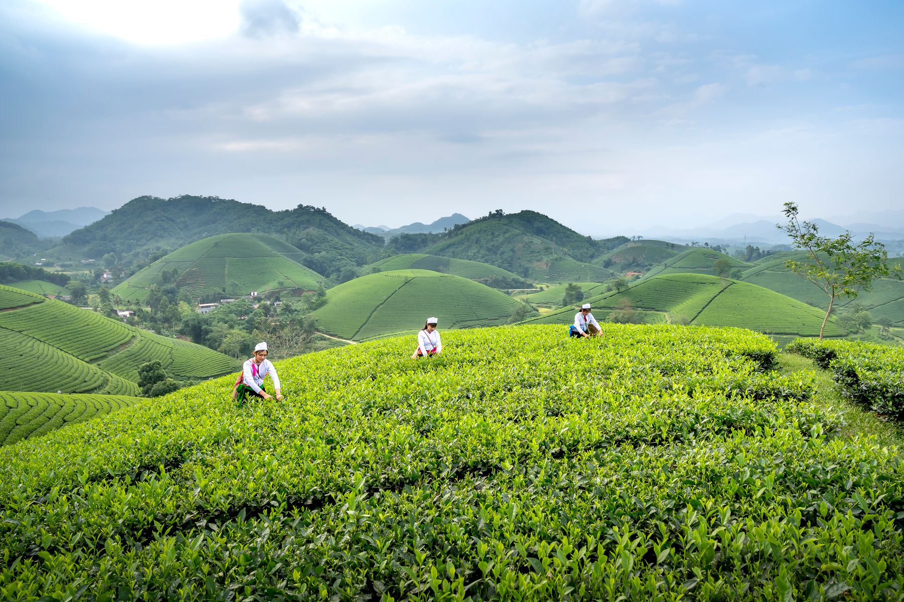
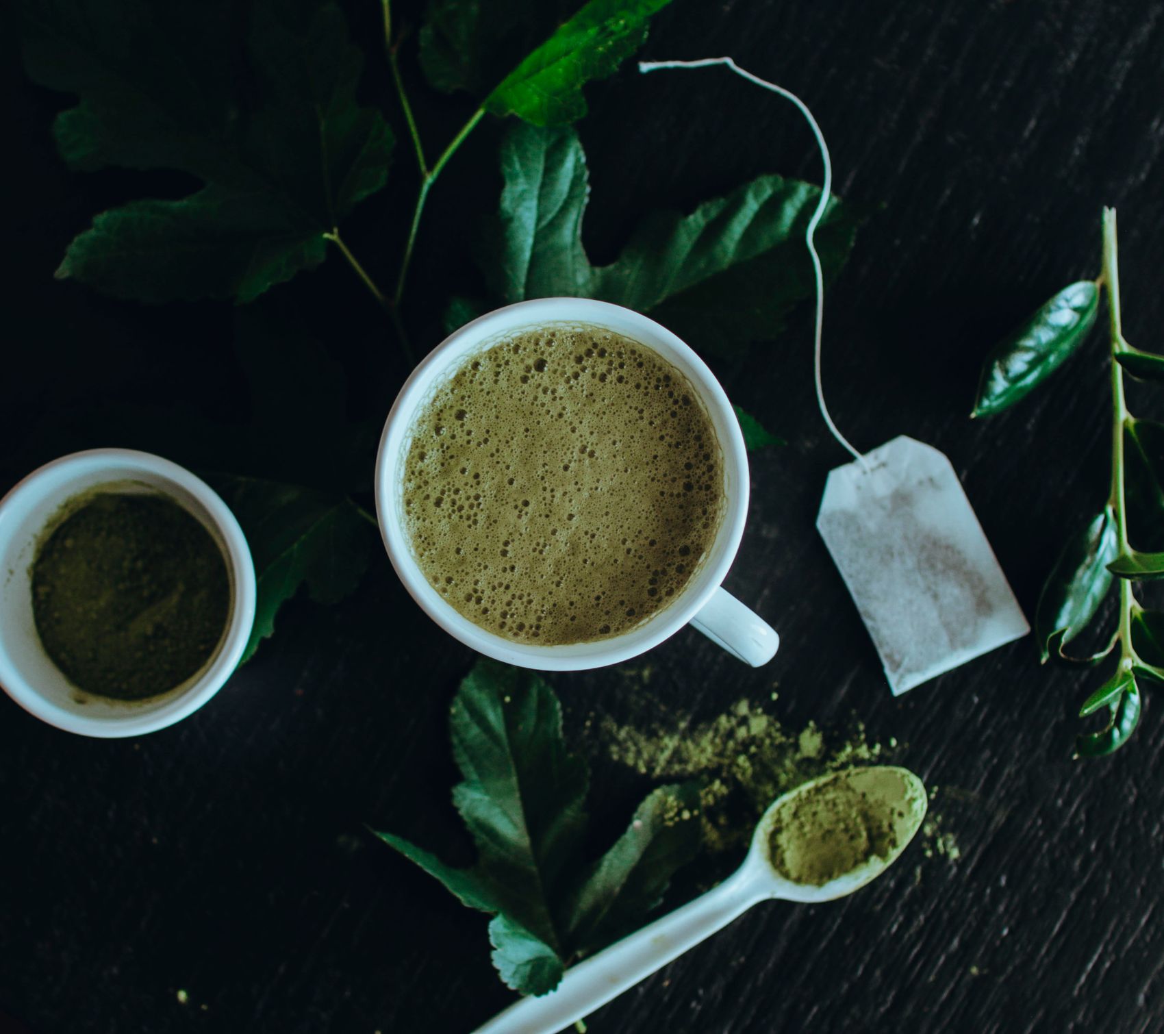
Matcha packaging is a color-preservation problem before it is a branding problem
A beautiful green identity cannot compensate for powder that loses color and aroma in the pack.
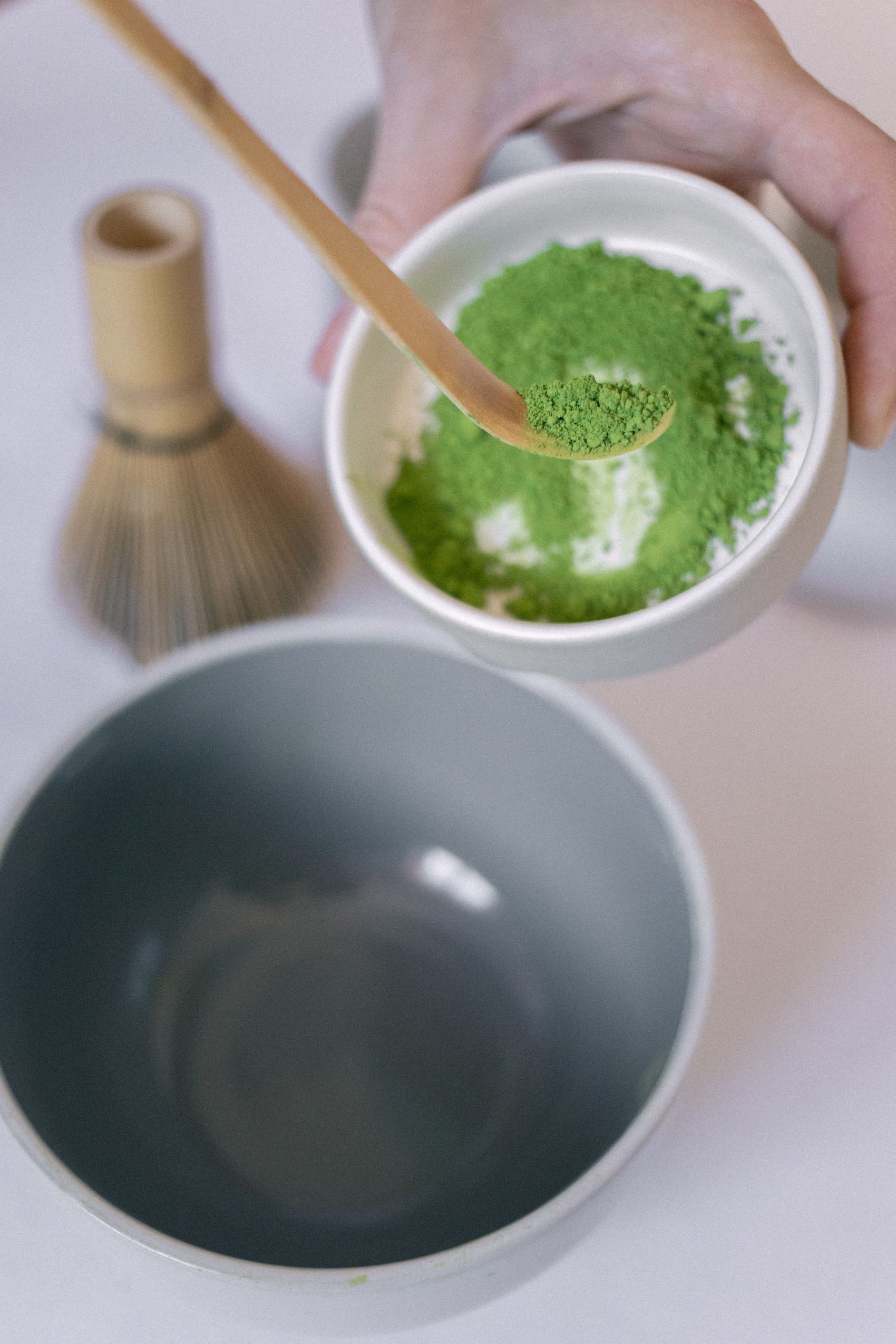
Protect the product first
Matcha is visually judged, which makes oxygen, light, moisture and heat control central to packaging. Before choosing paper textures, windows or transparent sections, confirm how the structure protects the powder throughout the expected shelf life.
Use color carefully
Green is an obvious category code but not a complete brand strategy. Premium systems often work better when green is balanced with calm neutrals, dark botanical tones or a distinctive accent. The goal is to make the product recognizable without looking interchangeable with every other matcha pack.
Design for global adaptation
Reserve space for multilingual labels, importer data, nutrition or ingredient panels, preparation instructions and compliance marks. A flexible back-panel grid makes it easier to adapt one visual system across markets without redesigning the entire pack.